Use a Responsive or Adaptive Design
Is your website still living in the 1990’s with coding based on a fixed width browser? Don’t worry, you’re not alone.
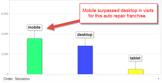
Many webmasters haven’t realized that nearly 60% of all visitors now come from a mobile device, with varied browser sizes. Case in point, this auto franchise received significantly more visits from mobile users in December of 2014:
If users have to manipulate your website on their mobile or tablet device using their fingers and touchscreen, you’ve created more work than your competitor who is likely about to get a new customer after your prospect gets frustrated and leaves.
Enter Responsive Design
Though not as tailored to individual devices as an adaptive design, responsive is the quickest and easiest way to address to fundamental issues:
- Users surf one-handed on mobile devices and will continue to do so
- Search engines prefer having only ONE URL to serve to mobile and desktop users
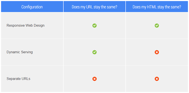
So before you go off creating a new mobile website, consider issue #2 above. While there are ways to handle two separate URLs, Google’s preferred method is for webmasters to use a responsive layout, reducing the need for an m.site.com or site.com/mobile URL. Here’s the link to the Google document we pulled the below comparison table from.
Examples of Responsive Design
Visit any WordPress theme store from 2015 on to find every latest theme build with a responsive layout. One of our favorite places to see master web designers at work remains CSS Zen Garden, where you’ll find a showcase of responsive design examples all using the same content but presenting it with different cascading style sheets (CSS) and imagery. We prefer this destination only because the coding is so clean and organized.
However, the industry’s largest showcase of responsive design examples is MediaQueri.es, where you’ll find a plethora of great designs and designers. However, keep in mind that many of the examples you’ll find rarely validate WebpageTest.org, W3C HTML or CSS validation or Google PageSpeed.
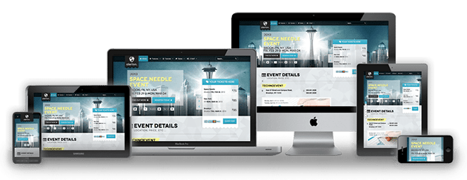
Below is an example image we borrowed from RocketTheme that best represents what designers should expect after completing a responsive website build.
Here is a list of pages to draw more inspiration from as you start thinking about responsive design:
- MediaQueri.es Responsive Designs
- CSS Zen Garden Examples
- The Betterment Blog’s Top 14
- DesignMoto’s 50 Example’s of Responsive Design
- Social Driver’s 60 Best Responsive Design Examples
What About Adaptive Design?
It’s possible that the page you’re reading this very moment might actually promote adaptive design over responsive design later this year or the next. In a nutshell, adaptive simply means you’ve designed different layouts for different ways users view content (called Viewport). Dustin Cartwright wrote an excellent article on Responsive Vs Adaptive Web Design suggesting that:
Because of the nature of adaptive layouts, they give much more control over the design of the website. You only have to design for specific viewports, and browsers only display the highest one that will fit in it’s width. These layouts are the ones that “snap” when adjusting as you resize your browser window.
There is more required in designing adaptive websites, not to mention theme configurations for content management systems such as WordPress that tend to rely on one style sheet, where adaptive designs may require many.
Testing Your Design
We’re huge fans of a new service at mobiletest.me, however, Dustin recommended Ripple Emulator and there are still quite a few designers using Mobile Phone Emulator and other tools. The best way to test is always with real devices. Pick up the phone, call or text some friends who use different devices and ask them how easy the site is to use or for honest feedback. Nothing beats a human test, ever.