Usability & Conversion Strategy & Checklist
We always tell our customers: “Even if we get you to the top of the search results, without the absolute best user experience, it’s not likely you’ll stay at the top for long.”
It’s true. Multiple experiments and studies (such as this one by Rand Fishkin of Moz), prove that Google uses user behavior signals as part of its scoring algorithm. If you have a limited amount of time and money to spend on your site, you’re definitely better off focusing on usability first, before spending time micro-optimizing keywords or working to attract links. Every day your less-than-effectively designed pages are seen by Google users counts against your overall score.
Relax, We’ll Get You Through This
We know you want to be #1 in Google, so does everyone! But there’s a right and a wrong way to go about it. This SEO Roadmap section will focus on attributes that can prevent users who visit your page via search results from hitting the back button.
Forget the Psychology
Many usability and conversion experts will completely disagree with any strategy that doesn’t include a vast amount of psychology. Keep in mind that these are the same folks that will charge you $20,000 or more if you want their opinion on what you actually should do. If you’ve got a million-dollar budget to work with, definitely consider a UX expert as your starting point. This usability and conversion roadmap was designed for the rest of us.
Instead of psychology, our roadmap focuses on three simple things:
Online Selling Fundamentals
Think for a moment about the dollars you spend on sales staff, traveling to close deals, and the countless hours of dialog and formulating responses when a prospect says they aren’t interested.
Now imagine the hundreds of thousands of dollars you spend on media, both TV and radio. The script, the design, the actor or actress, the messaging, the promo, and possibly even the call to action.
With the above in mind, why aren’t you spending the same amount of energy creating a page that is going to be seen as much or more than the advertising you’re doing offline? Why aren’t you using the same level of creative asset design for your page illustrations, the same messaging, promotions and call to actions that you spent thousands on with TV and radio?
It’s a simple question, but not always a simple answer due to the politics involved (the Marketing Department rarely gets credit for the online work).
Creative Writing Strategy Exercise
As part of this SEO Roadmap section, we encourage you to sit in on sales meetings for the next several weeks. Listen to how the sales representative starts the conversation, the tone they use, the words they use, and most importantly, how they identify the prospects’ challenges and later use those challenges to introduce your service as the solution to them.
If you take notes, you’ll end up with the story and experience you want your page to visually emulate. You’ll also end up with additional text you may be able to use as web copy for subpages to the main sales page you’re trying to rank for. When you do this, those subpages become supportive content, giving even more authority to the parent page.
The point here is to borrow selling practices that work offline for your online copy-writing process.
Selling Principles That Never Fail
There are dozens of sales principles shared by leaders such as Zig Ziglar, or any of the Sales Influencers listed here, that can be applied to your web design and individual pages. Below are a few of our favorites based on conversion experiments.
- Scarcity & urgency – think limited time offers, current offers, etc
- Trust – here are some required reading on trust signals
- Authenticity – don’t talk at your prospect, listen first and then talk to them
An excellent example of utilizing “scarcity and urgency” might be a timer or countdown on a product. Watch the video below where a shopper is reading about a high end product and (at second 00:26) is shown a countdown featuring a special offer:
Web Design Best Practices
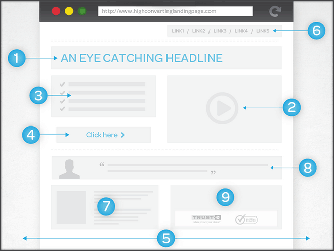
By far, the best example we’ve seen of a high converting landing page is the diagram previewed below, put together by Neil Patel, Co-Founder of KISSMetrics and CrazyEgg (advanced analytics tools to maximize conversion rates). Click the image to visit the full page at QuickSprout.com:
Other No-Brainer Design Best Practices
Below are a few other tips that may improve user experience and subsequently improve conversion rates:
- Reduce form fields to the absolute minimum (name, email, phone only if possible)
- Insure your website is responsive regardless of the user’s browser or device
- Keep your logo in the top-right corner
- Don’t get too creative with navigation – stick to top nav, footer nav, and sidebar (on subpages)
- Never make the user look for the call to action button – if the user has to think about it, you’ve failed
Actual User Experience Testing
One of our favorite tools to use for actual user testing is UserTesting.com, but it can be expensive. An alternative would be to use Survey Monkey to create a list of specific pages you would like a visitor to review with questions under each page (such as “do you immediately know what this page is offering?”). Take the URL from your survey and leverage Mechanical Turk to ask dozens of “Masters” to complete the survey.
The latter suggestion is a bit more complicated, but will save you quite a bit of money in the long-run.
Return to Top
More Conversion and Usability Strategy to Come!
It’s our goal to make this page as useful and thorough as possible. Please keep checking back for updates, or use ChangeDetection.com to get an alert when the page has been modified. Think smarter, right?
Thanks for reading!