With up to 35% of web traffic now coming from mobile devices, optimizing for mobile users has never been more critical. There are two components to mobile optimization to consider: Conversion Rate Optimization (MCRO) and Search Engine Optimization (MSEO). Conversion rates could affect search behavior and thereby affect rankings, and over-optimizing a webpage could absolutely affect your conversion rate. Therefore, we recommend optimizing simultaneously for conversion and SEO for best results. This article will help you cover both, well to an extent and at a very high level.
For best results, a website should first offer a mobile app (if you have one), followed by a mobile version of the website, and lastly a responsive design if the user opt’s out of the mobile version. Below is a diagram to describe the process:
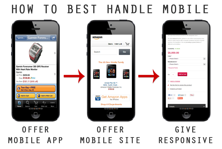
Offer a Mobile App
Though iOS and Android operating systems offer different levels of security, there are many great benefits to having a mobile app as opposed to being exclusively web-based. For example, if the user is not near a wi-fi connection, they may still be able use certain features and complete a transaction or event once they are online.
With an app, a business can take personalization to an entirely different level. With HTML limitations out of the picture, the features and scalability are nearly limitless.
A few good examples of mobile apps we like include:
- Amazon.com Mobile App
- Do by SalesForce
- Name.com Mobile App (Android | iPhone)
Offer a Mobile Version
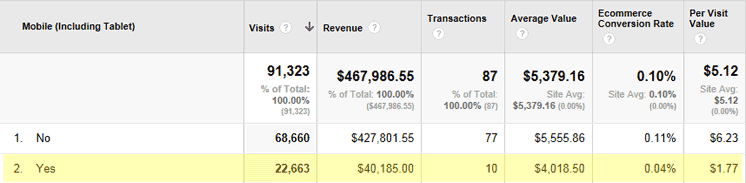
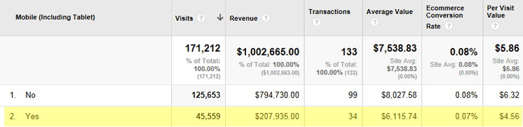
Having a mobile version of your website can be absolutely critical to your conversion rate. Take a look at the below April screenshots of an ecommerce website before deploying a mobile version (2012) and after (2013). Notice how before the mobile version deployed, mobile users made up for less than 10% of online revenue, compared to 26% after the mobile version launched.
Pre-Mobile Website
Post-Mobile Website
Mobile version means tap-friendly version
As mentioned above, when designing the mobile-version of a website, the user experience should be the foundation. For ecommerce, insure that users can find, shop, compare and purchase with ease.
A mobile user should never (ever) have to enlarge their display with their fingers or scroll horizontally to find content.
There are essentially two ways to serve a mobile website (listed below), however, SEO’s tend to prefer using the same URL with a mobile stylesheet to avoid duplicate content issues (many of which can be resolved with robots.txt directives and other techniques).
- Serve the same URL with a mobile stylesheet
- Redirect the user based on user-agent
Give a Responsive Desktop Website
Many users are jaded from mobile and will immediately search for a “View Full Site” button. In some cases, the drawback for users is their familiarity with the desktop website and not being able to immediately locate a specific product they previously found on that version.
Allow mobile visitors to choose the desktop view
Let go of forcing users to choose one experience or the other, they’ll thank you later. However, if they do choose to surf from a mobile device make sure that the desktop version has the mobile user in mind by allowing your website to be responsive to browser dimensions.
Great examples of responsive designs are appearing every day at MediaQueri.es. For WordPress-based websites, below are a few template libraries to get you started:
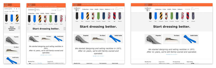
An example of a responsive desktop design can be seen at SkinnyTies.com. The screenshot below shows several different browser dimensions and how the website responds accordingly.
There are a number of paths to take when choosing how to handle mobile users. Our recommendation is offer a mobile app (if available), then take users to the mobile (tap-friendly) version, but offer the option to choose a responsive desktop version.
Update as of 9/30/13
From Brian Klais, CEO of Pure Oxygen Labs
http://www.internetretailer.com/2013/06/13/google-cracks-down-mobile-laggards
There are three things a retailer must do, Klais explains. First, a retailer’s site must have what is known as a “vary header” that indicates user agent (the mobile platform initiating a request); this tells Google that the content at the URL varies by user agent, Klais says. Second, for desktop pages and mobile pages that correspond to one another, retailers must insert on the desktop page a meta-tag called an alternate tag that identifies the mobile version of the desktop page and the mobile URL, Klais says. And third, to complete the loop, retailers must insert on the mobile page a meta-tag called a canonical tag that identifies the desktop version of the page and the desktop URL, Klais says.
How Do You Handle Mobile?
Please share you experience and best practices with handling mobile device optimization. Link to screenshot and web analytics if you have them. Thanks for reading!